Belo Horizonte, Brazil.
Photos by Gabriel Castro; Graphic design by Hardy Design
Belo Horizonte, Brazil.
Photos by Gabriel Castro; Graphic design by Hardy Design
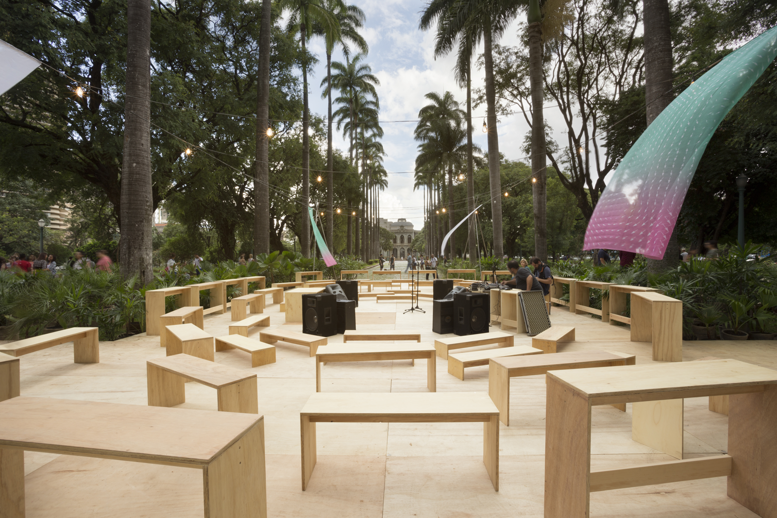
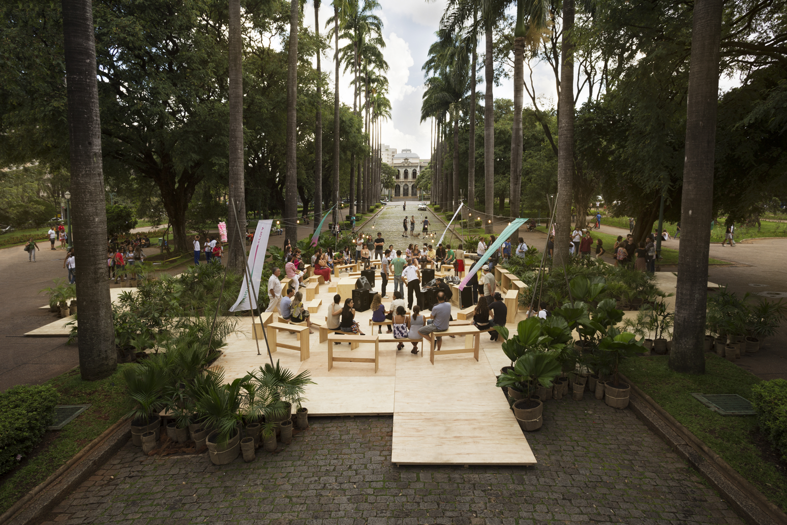
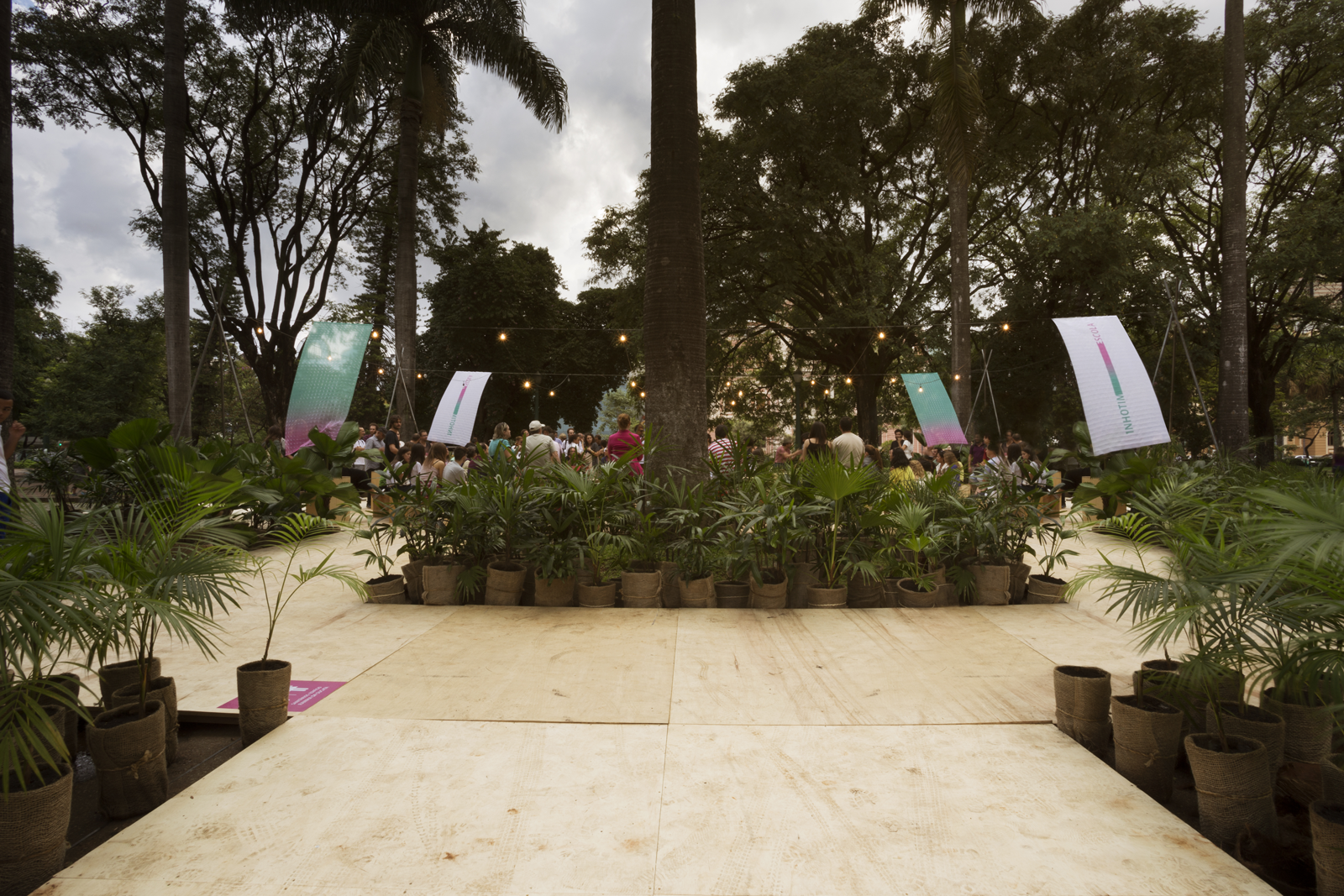
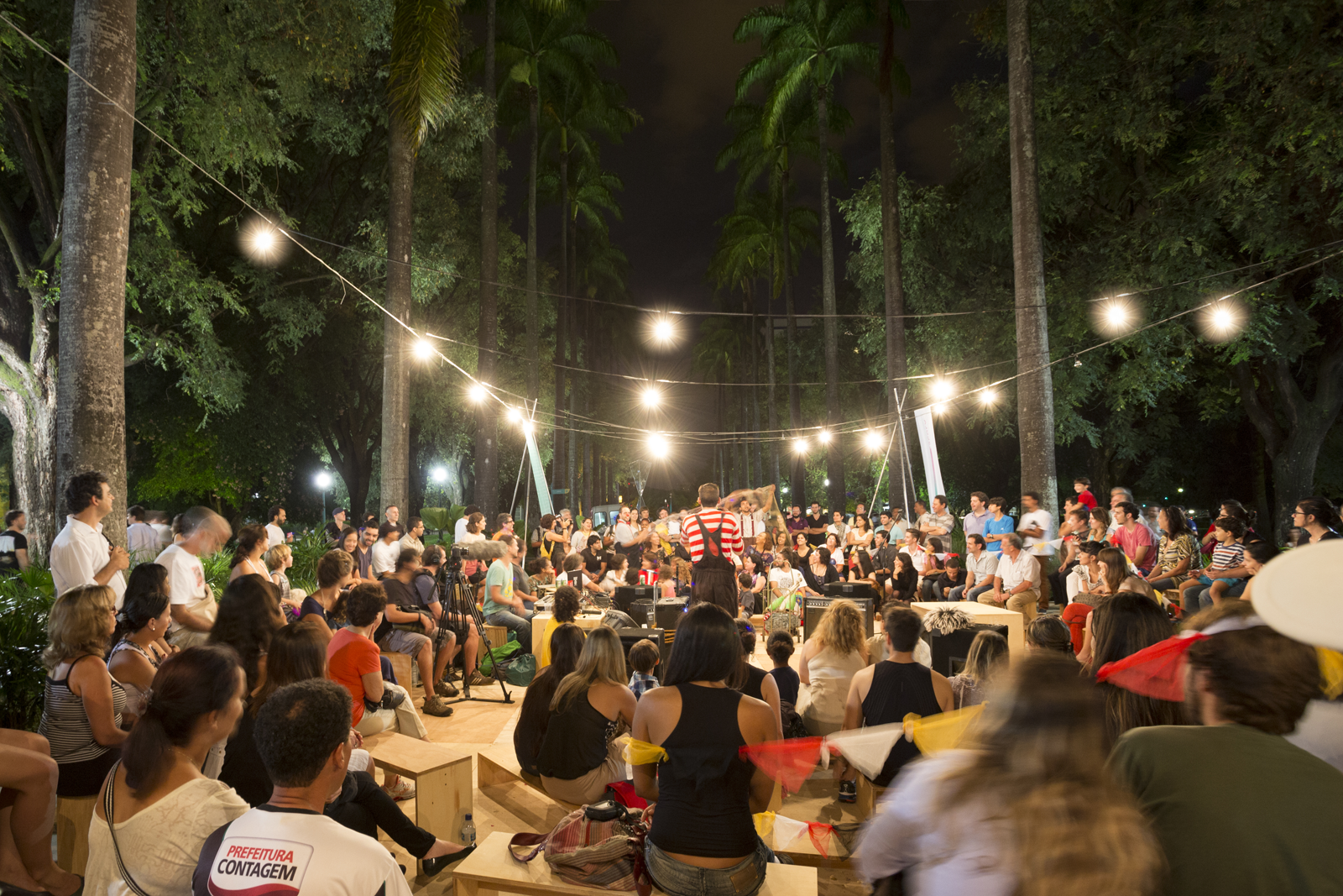
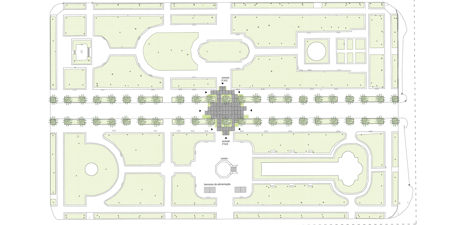
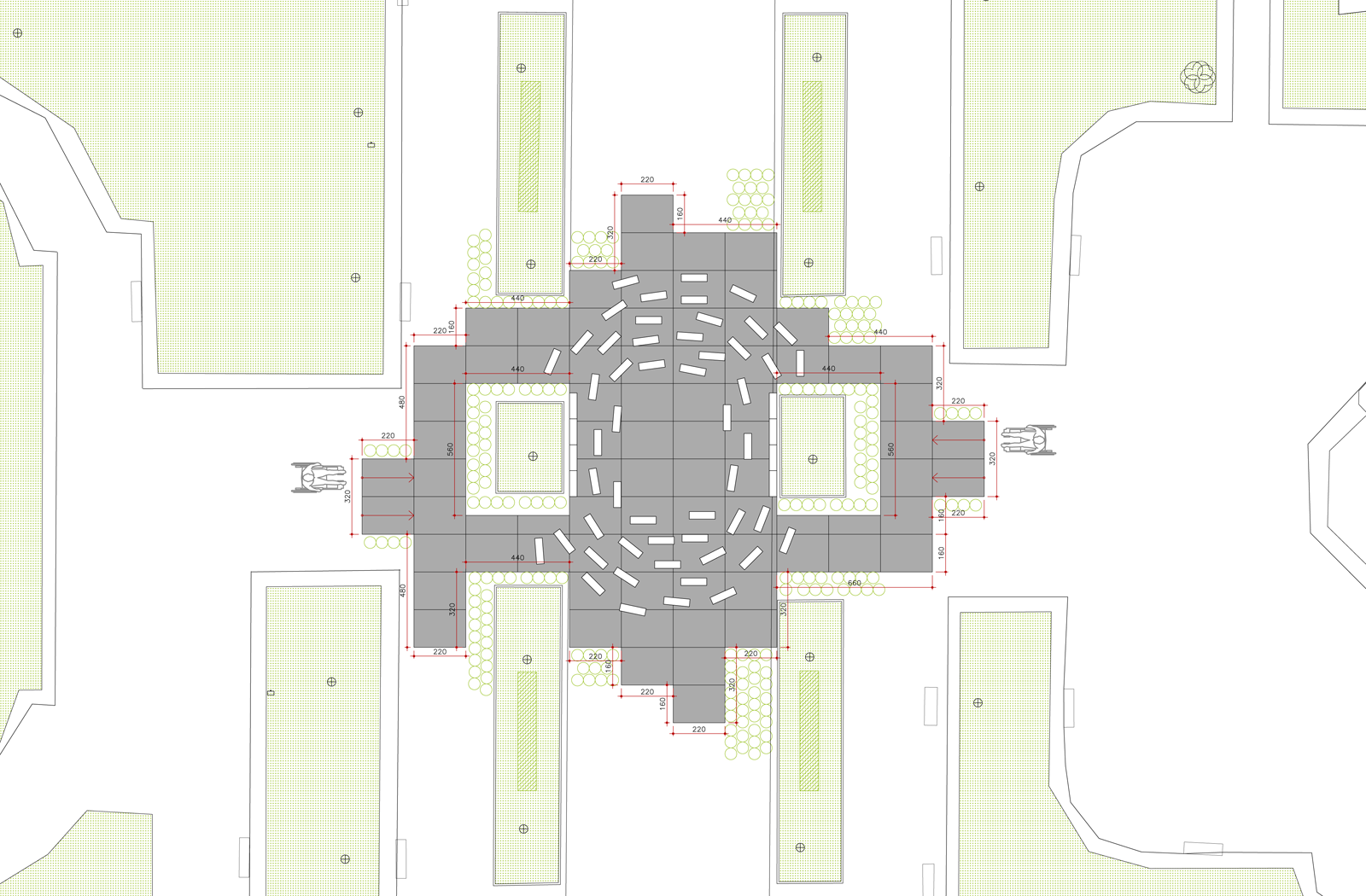
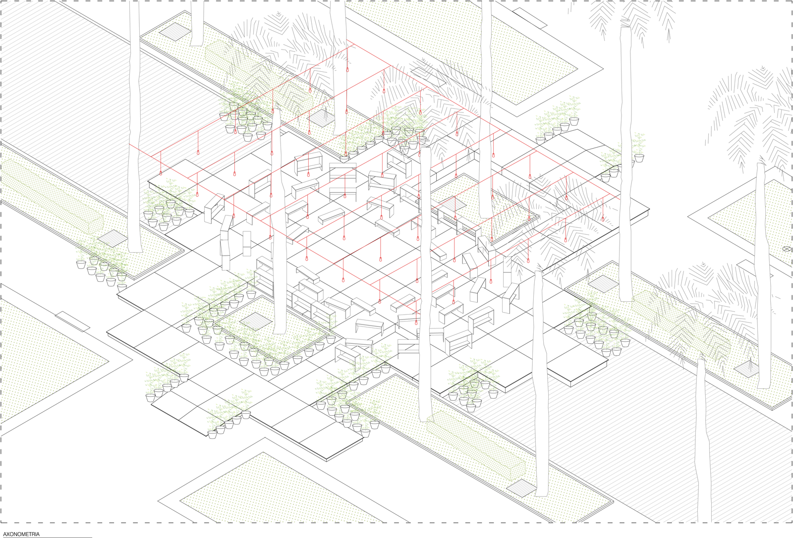
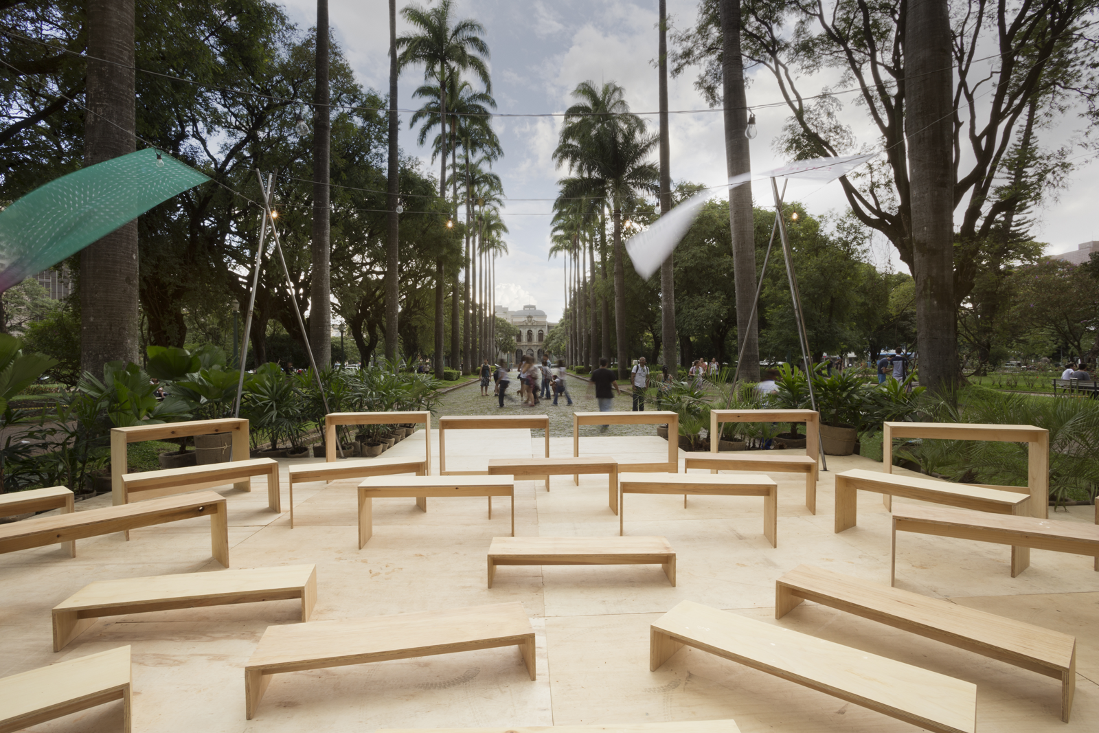
The scenic architecture design for the Inhotim Escola program’s launch starts from a wooden platform that adjusts the scale of the event in relation to the Liberty Square. The accesses are allowed in all directions, favoring the permeability of this space with respect to all existing paths in the square that go toward the event.
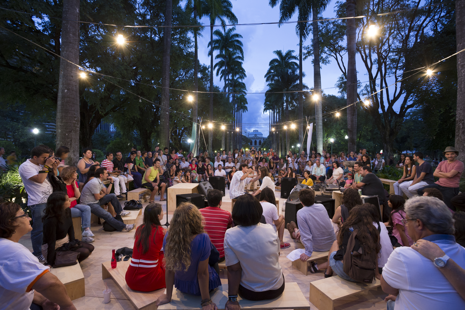
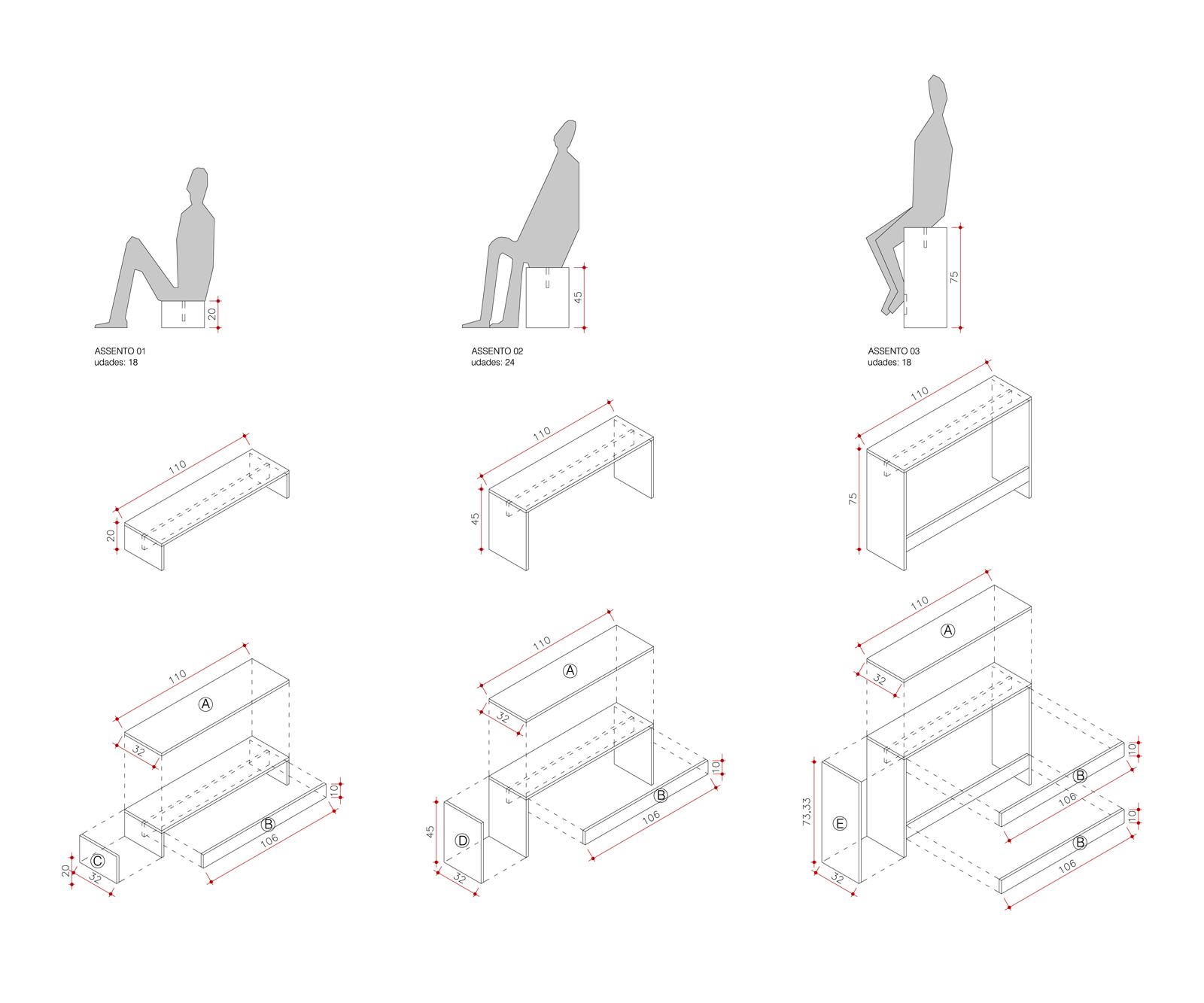
We propose a horizontal and continuous relationship between the public and the shows, eliminating any distinction on the platform between the audience and stage areas. The furniture is disposed freely and also built with wood, with three different heights for seating (or three ways to sit), becoming responsible for the configuration of the arena. Potted plants are used to create protection solutions and ambiance with the masses of foliage, which includes Inhotim’s botanical part in the launch of the program.
